# Lesson 7 Flexbox Layout
# Flexbox Layout
Let's learn how to use Flexbox for layout.
Flexbox is a new module that makes it easy to align elements to one another, in different directions and orders.
The idea behind flexbox is to give the container the ability to expand and to shrink elements to best use all available space.
Flexbox is used to build one-dimensional layouts.
- Video Link Intro to Flexbox
- Length: 8:21 minutes
- Size: 57.8 MB
Sample code can be found at https://github.com/mhintegrity/lesson07
# Flexbox Module, Properties for the Parent (flex container)
| CSS Property: default value; | Value list | Notes |
| display: flex; | defines a flex container for all its direct children | |
| flex-direction: row; | row row-reverse column column-reverse | defines the main-axis, direction |
| flex-wrap: nowrap; | nowrap wrap wrap-reverse | by default, flex items try to fit on one line |
| justify-content: | flex-start flex-end center space-between space-around space-evenly | align main axis |
| align-items: | stretch flex-start flex-end center baseline | align cross axis |
| align-content: | flex-start flex-end center space-between space-around | Only applies when there is more then one row of flex items. Cross axis if extra space |
# The two axes of flexbox
Main Axis The main axis is defined by flex-direction property which has 4 possible values.
- row
- row-reverse
- column
- column-reverse
Should you choose row or row-reserve, your main axis will run along the row in the horizontal direction. 
Choose column or column-reverse and your main axis will run from the top of the page to the bottom - in the block direction. 
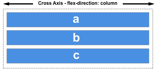
Cross Axis
The cross axis runs perpendicular to the main axis, therefore if your flex-direction (main axis) is set to row or row-reverse the cross axis runs down the columns.

If your main axis is column or column-reverse then the cross axis runs along the rows.

# Multi-line flex containers with flex-wrap
While flexbox is a one dimensional model, it is possible to cause our flex items to wrap onto multiple lines. In doing so, you should consider each line as a new flex container. Any space distribution will happen across that line, without reference to the lines either side.
flex-wrap: wrap; Now, should your items be too large to all display in one line, they will wrap onto another line. flex-wrap: nowrap; Which is also the initial value, and they will instead shrink to fit the container because they are using initial flexbox values that allows items to shrink. Using nowrap would cause an overflow if the items were not able to shrink, or could not shrink small enough to fit.
# Start and end lines
If the flex-direction is row, then the start end of the main axis will be on the left, and the end edge on the right.

# Properties for the Children (flex items)
| CSS Property: default value; | Value list | Notes |
| align-self: auto; | auto stretch flex-start flex-end center baseline | align-items for one item |
| order: | 0 <integer> | default, flex items are laid out in the source order |
| flex-grow: | 0 <integer> | defines the ability for a flex item to grow if necessary |
| flex-shrink: | 1 <integer> | defines the ability for a flex item to shrink if necessary |
| flex-basis: | auto <integer> | defines the default size of an element before the remaining space is distributed |
| flex: | flex-grow flex-shrink flex-basis | shorthand for flex-grow, flex-shrink and flex-basis combined |
# Properties applied to flex items
To have more control over flex items we can target them directly. We do this by way of three properties.
- flex-grow
- flex-shrink
- flex-basis
# The flex-grow property
With the flex-grow property set to a positive integer, flex items can grow along the main axis from their flex-basis. This will cause the item to stretch and take up any available space on that axis, or a proportion of the available space if other items are allowed to grow too.
If we gave all of our items in the example above a flex-grow value of 1 then the available space in the flex container would be equally shared between our items and they would stretch to fill the container on the main axis.
# The flex-shrink property
Where the flex-grow property deals with adding space in the main axis, the flex-shrink property controls how it is taken away. If we do not have enough space in the container to lay out our items and flex-shrink is set to a positive integer the item can become smaller than the flex-basis. As with flex-grow different values can be assigned in order to cause one item to shrink faster than others — an item with a higher value set for flex-shrink will shrink faster than its siblings that have lower values.
# Alignment, justification and distribution of free space between items
A key feature of flexbox is the ability to align and justify items on the main- and cross-axes, and to distribute space between flex items.
# align-items
The align-items property will align the items on the cross axis.
- stretch: The initial default value, which will stretch to the height of the tallest item. Stretching to fill the flex container.
- flex-start: Makes the items line up at the start of the flex container.
- flex-end: Makes the items line up at the end of the flex container.
- center: Makes the items line up at the end of the flex container.
# justify-content
The justify-content property is used to align the items on the main axis, the direction in which flex-direction has set the flow.
- flex-start: The initial default value, which will line the items up at the start edge of the container.
- flex-end: Line the items up at the end.
- flex-center: Line the items up to group in the center.
- space-between: This takes up all the space space after the items have been laid out, and shares it out evenly between each item.
- space-around: Causes a half sized space on either end.
- space-evenly: Causes the space to be shared equally around each item.
# A Responsive Image Gallery
We want to bring what we have learned about flexbox transition and images together in a better image gallery.
The code for this section can be found on another branch at github called responsive-image-gallery. Please download the code and try it out on your machine. https://github.com/mhintegrity/lesson07/tree/responsive-image-gallery
- Video Link How to Download Responsive Image Gallery
- Length: 1:59 minutes
# Assignment due for discussion next class and checked into GitHub by the Monday after that.
- create a new repo called lesson07
- Create your own website using the responsive image gallery.
- Use your own images and content inside the container items.
