# Lesson 6 Navigation Menus
# Navigation Menus
First, we will create a starting HTML page.
- Create a starting page called index.html
- Use the code snippet in VS Code to create a basic HTML structure.
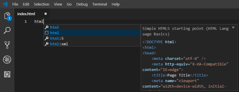
- In your blank page named index.html type in
HTMLand from the dropdown choose "Simple HTML starting point"
- Set the html head title to "My Blog Page"
- Create a new CSS file named
main.css - create a new html element nav section with a few links that will become our menu items.
<nav class="navbar"> <div class="dropdown"> <button class="dropbutton activemenuitem">Blogs</button> <div class="dropdown-content"> <a href="index.html">Blog Article 1</a> <a href="index.html#article2">Blog Article 2</a> <a href="index.html#article3">Blog Article 3</a> </div> </div> <a id="aboutmenu" href="about.html">About</a> </nav>- We have added a class named navbar to make it easier to style with CSS
- We added a generic element div with a class of dropdown so that we can group and show our dropdown navigation items only when we hover over.
- There are two classes applied to the div dropdown. The second div activemenuitem is used to highlight which menu item the current page is.
- Next create three article elements, and in those elements add 3 paragraph elements.
<div class="contentbody"> <article id="article1"> <h2>Article 1</h2> <p>Lorem ipsum</p> <p>Lorem ipsum</p> <p>Lorem ipsum</p> </article> ... </div>- There is a built to VS Code that allows you to generate random Latin words for fake content. after entering the paragraph element <p> type lorem then hit [Tab] key.
- See wikipedia for the history of lorem ipsum.
- Give each article a unique id that is unique. article1, article2, article3.
- surround all the articles with a generic element div. Give that div tag the class="contentbody"
- In your blank page named index.html type in
- Create another html page named "about.html"
- On this page copy index.html, except replace the articles with an <h1>About Me<h1>
- Move the activemenuitem class from the div="dropdown to the href="about.html"
- this makes the about menu item highlighted in green for the about page.
- Notice that both pages have the same basic navigation and use the same CSS file.
- First let's create a simple Vertical Navigation Menu
- Video Link Vertical Nav Bar
- Length: 8:21 minutes
- Size: 57.8 MB
- Now let's create a new CSS file main.css
- Removing browser default margins and padding, and add a width and background color.
.navbar { margin: 0; padding: 0; background-color: black; width: 200px; } - Hide our dropdown button by selecting the class .dropbutton, so we only see links in our menu.
.dropbutton { display: none; } - display Property: The display property specifies the display behavior (the type of rendering box) of an element.
- none -> The element is completely removed
- inline -> Displays an element as an inline element (like <span>). Any height and width properties will have no effect.
- block -> Displays an element as a block element (like <p>). It starts on a new line, and takes up the whole width
- inline-block -> Displays an element as an inline-level block container.
- Lets turn our links into clickable black boxes.
.navbar a { display: block; padding: 14px 16px; text-decoration: none; color: white; font-size: 16px; text-align: center; } - padding Property: An element's padding is the space between its content and its border.
- padding: shorthand property for: padding-top padding-right padding-bottom padding-left
- If the padding property has two values: padding: 14px 16px;
- top and bottom padding are 14px
- right and left padding are 16px
- If the padding property has one value: padding: 14px;
- all four paddings are 10px
- text-decoration: none; turns off the browser underline behavior for a link <a>
- Let's change the color of our menu item when we move our mouse over it to indicate that it's clickable.
.navbar a:hover {
    background-color: gray;
}
- Video Link Vertical Nav Bar
- Let's convert the Vertical Menu to a Horizontal Navigation Menu
- Video Link Horizontal Nav Bar
- Length: 6:08 minutes
- Size: 45.9 MB
- Change our navbar div class width to 100% to stretch full screen width.
body { margin: 0; padding: 0; background-color: whitesmoke; } .navbar { /* margin: 0; padding: 0; */ background-color: black; /* width: 200px; */ width: 100%; } - Change from vertical orientation to horizonal for our menu item. Change the display property of our navbar links from block to inline-block;
.navbar a { /* display: block; */ display: inline-block; padding: 14px 16px; text-decoration: none; color: white; font-size: 16px; text-align: center; } - Update our index.html and about.html files to use <span> instead of <div> for our nav class items.
- The difference between span and div is that a span element is in-line and usually used for a small chunk of HTML inside a line (such as inside a paragraph) whereas a div (division) element is block-line (which is basically equivalent to having a line-break before and after it) and used to group larger chunks of code.
- Video Link Horizontal Nav Bar
<nav class="navbar">
    <span class="dropdown">
        <button class="dropbutton activemenuitem">Blogs</button>
        <span class="dropdown-content">
            <a href="index.html">Blog Article 1</a>
            <a href="index.html#article2">Blog Article 2</a>
            <a href="index.html#article3">Blog Article 3</a>
        </span>
    </span>
    <a id="aboutmenu" href="about.html">About</a>
</nav>
* Align our About menu item to the right hand side of the screen by selecting the aboutmenu id and add property **float: right;**
    ```CSS
    #aboutmenu {
        float: right;
    }
    ```
- Let's Convert our Blog Articles into a Dropdown Menu
- Video Link Nav Bar with DropDown Menu
- Length: 6:35 minutes
- Size: 49.6 MB
- First delete or comment out the CSS Property "display: none" for the button element with a class name .dropbutton, so that it will appear again.
- Now lets style the Blogs button to look like the other menu items.
- CSS Property "border: none" will turn off the natural button border style.
.dropbutton, .dropdown-content { background-color: black; border: none; min-width: 125px; } - We want the hover color gray for the button like our other menu links.
.dropdown:hover .dropdown-content { display: block; } - Position the dropdown content
- CSS position property specifies the type of positioning method used for an element (static, relative, absolute, fixed, or sticky).
- static Default value. Elements render in order, as they appear in the document flow
- absolute The element is positioned relative to its first positioned (not static) ancestor element
- fixed The element is positioned relative to the browser window
- relative The element is positioned relative to its normal position, so "left:20px" adds 20 pixels to the element's LEFT position
- sticky The element is positioned based on the user's scroll position
- inherit Inherits this property from its parent element
.dropdown {
    position: relative;
    display: inline-block;
}
- CSS position property specifies the type of positioning method used for an element (static, relative, absolute, fixed, or sticky).
- Make the content of the dropdown vertical and add a dropshadow effect.
- CSS box-shadow property attaches one or more shadows to an element.
- box-shadow: horizontal-offset vertical-offset blur-radius spread color
- horizontal-offset The horizontal offset of the shadow. A positive value puts the shadow on the right side of the box, a negative value puts the shadow on the left side of the box
- vertical-offset The vertical offset of the shadow. A positive value puts the shadow below the box, a negative value puts the shadow above the box
- blur-radius The higher the number, the more blurred the shadow will be
- spread A positive value increases the size of the shadow, a negative value decreases the size of the shadow
- color see previous discussions about color, make sure to set the alpha channel, we set to .2 which is 20% visible.
.dropdown-content {
    display: none;
    /* position the dropdown content */
    position: absolute;
    box-shadow: 0px 8px 16px 0px rgba(0,0,0 0.2);
    z-index: 1;
}
- Highlight the menu item on each page for the current page.
.activemenuitem { background-color: green; } - Add padding for the displaying content by selecting the class contentbody
.contentbody {
    padding: 25px 25px;
}
- Video Link Nav Bar with DropDown Menu
# CSS Display
The display property specifies if/how an element is displayed.
Every HTML element has a default display value depending on what type of element it is. The default display value for most elements is block or inline.
A block-level element always starts on a new line and takes up the full width available (stretches out to the left and right as far as it can).
Examples of block-level elements:
* <div>
* <h1> - <h6>
* <p>
* <form>
* <header>
* <footer>
* <section>
An inline element does not start on a new line and only takes up as much width as necessary.
Examples of Inline Elements
* <span>
* <a>
* <img>
# CSS Overflow
The overflow property specifies whether to clip/hide content or to add scrollbars when the contents of an element are too big to fit in a specified area. The overflow property only works for block elements with a specified height. The overflow property has the following values:
- visible - Default. The overflow is not hidden. It has shown outside the element's box
- hidden - The overflow is hidden, and the rest of the content will be invisible
- scroll - The overflow is hidden, but a scrollbar is added to see the rest of the content
- auto - If overflow is hidden, a scrollbar should be added to see the rest of the content
Sample code for Lesson 05 can be found at https://github.com/mhintegrity/lesson06
# Assignment due for discussion next class and checked into GitHub by the Monday after that.
- create a new repo called lesson06
- Create your own website using techniques we have already learned.
- must have at least two pages, index.html for the first page.
- Make a menu to navigate between the pages.
- The menus must look the same on both pages and allow you to navigate between them.
- Suggestion: use your page with images from lesson 05.
- Make sure your index.html page has at least one image in it.
