# Lesson 22 Vue Components More
Because we are working with .vue files, we use a Module System for registration of our components. You can find details at the vue site https://vuejs.org/v2/guide/components-registration.html
- We need to register each of the components we want to use in each component that uses them. In our lesson 21 example, we registered
AwardCard.vueinsideApp.vue. - Quick note: In lesson 21 we registered
AwardCardin ourApp.vuecomponent and then used it as<award-card>in our template section. This worked becauseVue.jsautomatically registered the hyphenated version of our component selectoraward-card. - If we register our component without specifying a tag name, we get both the hyphenated and original name, like in our lesson 21 example.
components: { AwardCard },- both of these work
<AwardCard v-for="award in awards" v-bind:key="award.id" v-bind:award="award"/> <award-card v-for="award in awards" v-bind:key="award.id" v-bind:award="award"/> - If we specify our components name, then only the specified component tag name works.
components: { 'award-card', AwardCard },- only the specified name works
<award-card v-for="award in awards" v-bind:key="award.id" v-bind:award="award"/>
We also learned in lesson 21 that there is a <style> section in each vue component.
- Any CSS we place in the
<style>section will apply to all CSS on the page. - If we want to apply our CSS only to the component, we need to add the attribute scoped to the tag like this
<style scoped>. Scoped is another way of saying: limit the scope of the CSS only to this component.
We setup props for our components that were of type: String and type: Object.
- We also set them to be
required: true, which is called validation. Validation just means that our code checked to make sure the properties passed into a component are valid according to the rules we have setup. - There is another value that you can set instead of
required, it isdefault. We can usedefaultto do the opposite of required. When a prop on a component doesn't have a prop set, then the prop will instead of causing an error (ifrequired: trueis used) it will be filled with the default value. Here is an example for a prop of type String.props: { title: { type: String, default: 'Active Martial Arts' } } - For a prop of type
Objectwe need to return a function, that returns the object, like we did fordatain components.props: { title: { type: Object, default: function() { return { title: 'Active Martial Arts'; } } } }
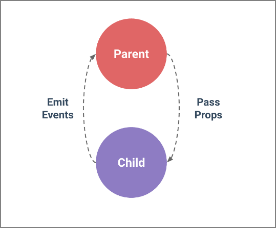
# Passing Data from Child Component to Parent
You can send data from a child component to a parent component by means of Vue’s built-in $emit() method. The first parameter of $emit is the event that should be listened for in the parent component. The second (optional) parameter is the data value to pass. Think of emit as an emitter (def: object that puts out something.)
- Unlike components and props, event names don’t provide any automatic case transformation. Instead, the name of an emitted event must exactly match the name used to listen to that event. For these reasons, we recommend you always use kebab-case for event names.
this.$emit('child-event');- In the parent component we need to add an event listener to our template reference to the child tag like this:
<child-component v-on:child-event="doSomething"></child-component>- The doSomething would call a local method. We can also pass data as the second argument of
$emit
this.$emit('child-event', this.dataName);- And bind a local data item to the returned event in our parent component like this. Note: we are setting a local data object equal to
$eventwhich is the returned event object/variable.
<child-component v-on:child-event="localData = $event"></child-component>
# 
- Video Link Passing Data from Child Component to Parent
- Length: 15:34 minutes
- Size: 50 MB
# Page Layout using Components (Sample App)
In lesson 6 we learned about HTML layout elements
# HTML Layout Elements
<header>- Defines a header for a document or a section<nav>- Defines a container for navigation links<section>- Defines a section in a document<article>- Defines an independent self-contained article<aside>- Defines content aside from the content (like a sidebar)<footer>- Defines a footer for a document or a section<details>- Defines additional details<summary>- Defines a heading for the<details>element
# HTML Layout Using Flexbox/CSS
- Copy
lesson21into a new folderlesson22, don't copy thenodes_modulesand.gitfolders. - re-initialize git and push our initial code (same as lesson21) to github
- HTML in our
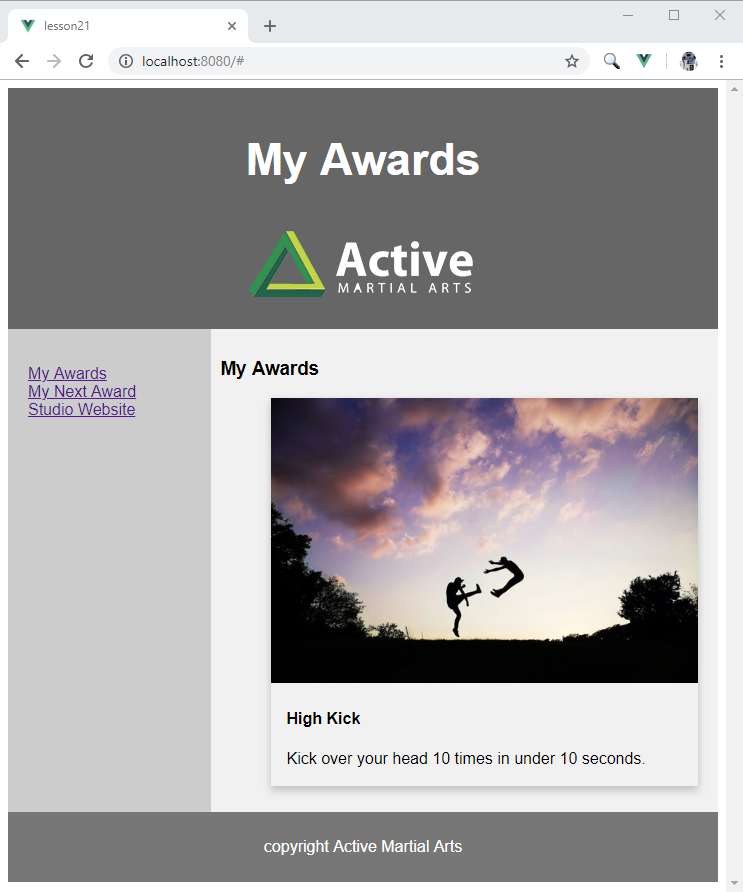
App.vuetemplate section<div id="app"> <header> <h2>My Awards</h2> <img id="logo" alt="Active Martial Arts Logo" src="./assets/ActiveLogo.png"> </header> <section> <nav> <ul> <li><a href="#">My Awards</a></li> <li><a href="#">My Next Award</a></li> <li><a href="#">Studio Website</a></li> </ul> </nav> <article> <h1>My Awards</h1> <ul> <li class="card"> <img src="./assets/clouds-fight-jumping-62376.jpg" style="width:100%"> <div class="container"> <h4><b>High Kick</b></h4> <p>Kick over your head 10 times in under 10 seconds.</p> </div> </li> </ul> </article> </section> <footer> <p>copyright Active Martial Arts</p> </footer> </div> - In our
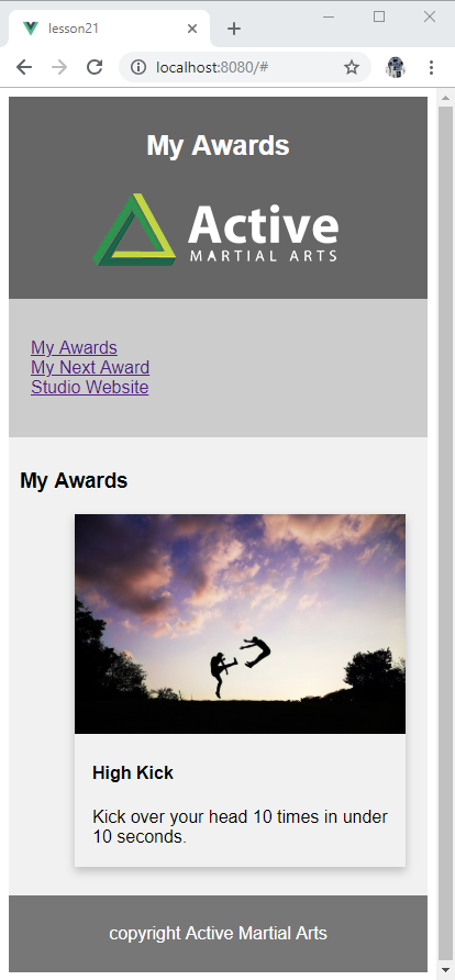
App.vuestyle section* { box-sizing: border-box; } body { font-family: Arial, Helvetica, sans-serif; } /* Style the header */ header { background-color: #666; padding: 30px; text-align: center; font-size: 35px; color: white; } /* Container for flexboxes */ section { display: -webkit-flex; display: flex; } /* Style the navigation menu */ nav { -webkit-flex: 1; -ms-flex: 1; flex: 1; background: #ccc; padding: 20px; } /* Style the list inside the menu */ nav ul { list-style-type: none; padding: 0; } /* Style the content */ article { -webkit-flex: 3; -ms-flex: 3; flex: 3; background-color: #f1f1f1; padding: 10px; } /* Style the footer */ footer { background-color: #777; padding: 10px; text-align: center; color: white; } /* Responsive layout - makes the menu and the content (inside the section) sit on top of each other instead of next to each other */ @media (max-width: 600px) { section { -webkit-flex-direction: column; flex-direction: column; } } - What does this layout look like
- Now Shrink the screen width and you will see the navigation section move above article.
# Using Vue Components Lets Rebuild our Layout
Let's now breakdown our page parts into separate components, in separate component files.
- In the
App.vuecomponent template section of our scaffolding, lets add custom component tags for our sections. - Crete a new
AppHeader.vuefile in the components directory.- Use
scaffoldto create the three sectionstemplate,script, andstyle - Inside
templatecopy all theheadertag code fromApp.vueinto thetemplatesection ofAppHeader.vue - Replace the
My Awardstext with
{{ title }}- Add a prop for title in the
scriptsection. Make it required.export default { props: { title: { type: String, required: true } } } - The
AppHeader.vuecomponent file is one directory deeper thenApp.vue, so we need to add another period.to the beginning of oursrc="./assets/ActiveLogo.png"becomessrc="../assets/ActiveLogo.png" - Change
styletag to add the attributescopedlike this<style scoped> - Move our CSS for the header from
App.vuetoAppHeader.vue. It has a comment section called/* Style the header */
<style scoped> header { background-color: #666; padding: 10px; text-align: center; font-size: 4vw; color: white; } #logo { max-width: 100%; } </style>- Replace the
headertag code section inApp.vuewith a call to the new component<app-header title="My Awards"></app-header>and use the custom proptitleto pass in our title. - In
App.vuein thescriptsection under theimport AwardCardadd a new import for the new header componentimport AppHeader from "./components/AppHeader.vue"; - Also add a reference to component in
export default { components: }asAppHeadercomponents: { AwardCard, AppHeader, AppFooter },
- Use
- Create another component file named:
AppFooter.vue, follow the same procedure as forAppHeaderabove, except it should look like this.<template> <footer class="container"> <p>{{ title }}</p> </footer> </template> <script> export default { props: { title: { type: String, required: true } } } </script> <style scoped> footer { background-color: #777; padding: 10px; text-align: center; color: white; } </style> - Create another component file named:
AppNav.vue, follow similar procedures as forAppHeaderabove, except it should look like this.<template> <nav> <ul> <li><a href="#">My Awards</a></li> <li><a href="#">My Next Award</a></li> <li><a href="#">Studio Website</a></li> </ul> </nav> </template> <script> export default { } </script> <style scoped> nav { -webkit-flex: 1; -ms-flex: 1; flex: 1; background: #ccc; padding: 20px; } /* Style the list inside the menu */ nav ul { list-style-type: none; padding: 0; } </style>- Replace the
<nav>section inApp.vuewith<app-nav></app-nav> - Next lesson we will learn how to navigate our application using
vue router, so for now these navigation items don't work.
- Replace the
- Back in
App.vuewe need to switch from a single<li>to what we had in lesson 21.<ul class="AwardsList"> <award-card v-for="award in awards" v-bind:key="award.id" v-bind:award="award" /> </ul>
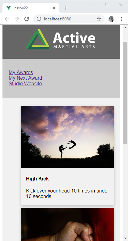
Here is what our final project should look like when you run npm run serve
# Recommended, Referenced, Links and Articles
- Article Working Through Roadblocks – A Guide for New Programmers
- Link https://vuejs.org/v2/guide/components-registration.html
# Assignment due for discussion next class and checked into GitHub by the Monday after that
- Follow along with the lesson and create the
lesson22app and check it into your github account under repo namedlesson22. - Write up a few paragraphs of explanation of what you want to do for your final project (Project Plan). Then break it down into multiple steps, these are your milestones. Think of them as versions. The first milestone should be be version 0.1, then 0.2 ... with 1.0 being the final delivery milestone. Keep your 1.0 goal attainable. You can also define beyond 1.0, for example 1.1 for minor updates and 2.0 for a major upgrade.
- Submit a draft of your project plan by Slack.